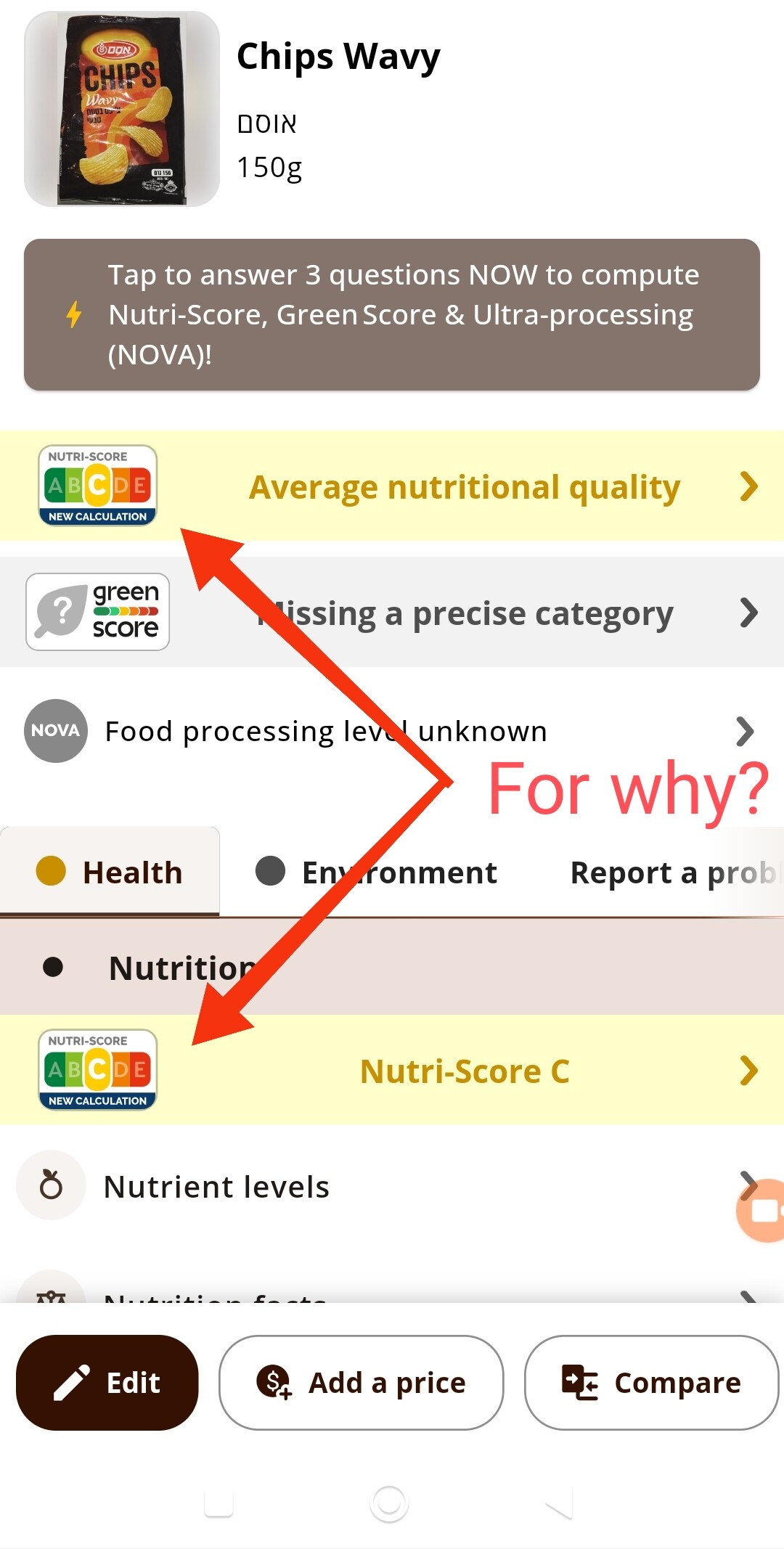
OFF mobile app have two Nutri-Scores on every product page. What is the reason for this behavior? Both go to the same page with the same content, so it is just an annoying duplicate, that takes free space and is one of the reasons, why the interface is so over complicated and overloaded in my perception (it already has too many big buttons on the same page).
I think the one that is upper the tabs is unnecessary.