I was going through the discussion , found it very fascinating and thought to share my ideas
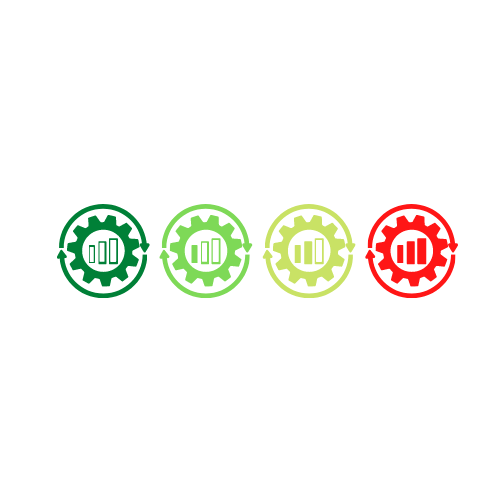
I agree with @stephane factory bars look like battery bars and more bars gives better vibe. so putting these bars inside processed icon might the change view and in case of colors @alex we can play with it!
Red and green are really bad, as 8% of the males have some problems seeing it.
I prefer the factory icons, but the lines of the levels not build should be dashed and in a mixed (RGB) color, which is hopefully not affected from color blindness.
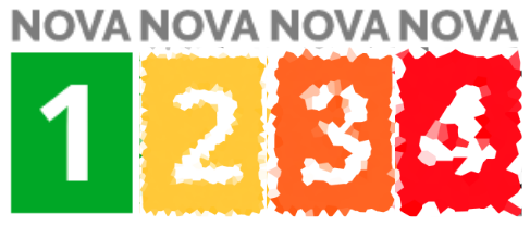
Why exist NOVA 1 and 2, when it only makes a difference between NOVA ≤3 and 4?